
PROJECT OVERVIEW
Overview:
UX audit and end-to-end redesign of the Tako Grill digital platform, improving task completion, navigation clarity, and responsive usability across desktop and mobile.
UX Audit & Responsive Product Redesign
TAKO Grill Digital Product Redesign
Final responsive mobile interface
Problem Statement:
The existing platform contained structural and usability issues that prevented users from efficiently browsing the menu, making reservations, and completing orders. Navigation lacked clarity, content hierarchy was inconsistent, and the interface did not scale effectively across devices.
Goal:
Improve task completion efficiency by restructuring navigation, clarifying information hierarchy, and optimizing the ordering and reservation experience across desktop and mobile platforms.
Action Statement:
I conducted a UX audit and redesigned the product experience by restructuring information architecture, optimizing task flows, and establishing a scalable visual and interaction system across mobile and desktop.
Timeline:
3 weeks
Tools:
Figma, Adobe-Illustrator, and Photoshop
Role:
UX/UI Designer
Scope:
UX Audit, Interaction Design, Responsive Design
Skills Applied
– Competitive Analysis & UX Research
– Persona Creation & Journey Mapping
– Wireframing & Responsive Prototyping (Web+Mobile)
– Visual Design & Style tiles
– Atomic Design System (Atoms, Molecules, Organisms)
– Documentation & Presentation
REDESIGN COMPARISON
ORIGINAL WEBSITE /AUDIT SUMMARY
The UI/UX audit of the existing Tako Grill website revealed several usability and design challenges that impact the overall user experience. One of the major issues was the presence of non-functional purchase features, making it difficult or impossible for users to complete online orders. The site also lacked high-quality images, which diminished the visual appeal and failed to showcase the food in an engaging way.
Additionally, there were significant navigation issues, including unclear menu paths and missing return buttons, which made browsing frustrating and unintuitive. The visual design lacked cohesion, with inconsistent fonts, poor layout hierarchy, and limited use of design elements to guide users effectively. Lastly, the content organization was cluttered and unstructured, making it hard for visitors to quickly find important information such as hours, location, or contact details.


UPDATED WEBSITE /UX SOLUTIONS
After analyzing the Tako Grill website and comparing it with similar restaurant platforms, I developed a set of enhancements aimed at improving both usability and brand expression. I refined the typeface and layout to support clearer content organization and a more inviting reading experience. Visual engagement was elevated by incorporating high-quality images and introducing Japanese-inspired patterns and colors to reflect the restaurant’s cultural ambiance.
To improve functionality, I designed a direct purchase flow and added a dedicated reservation page to help reduce wait times. I also introduced an order tracking feature for customer convenience and featured Happy Hour promotions on the landing page to drive engagement. Finally, I restructured the navigation to ensure a smoother, more consistent user journey across the site.


DESIGN DECISIONS & TRADEOFFS
To improve usability, I introduced a consistent grid system and reduced visual fragmentation across pages. Primary actions, such as ordering and reservations, were elevated using hierarchy, color contrast, and placement within the visual scanning path (F-pattern). Navigation was simplified to reduce cognitive load and enable faster task completion. Content grouping and typography scaling improved readability and allowed users to scan information efficiently.
I prioritized clarity over feature density by reducing navigation options from 11 to 5, improving usability while slightly reducing shortcut access.
NAVIGATION & TASK FLOW OPTIMIZATION
BEFORE:
• Navigation contained 11 fragmented and redundant items, increasing cognitive load
• Menu categories were separated, creating inefficient browsing and inconsistent flow
• Key features such as Reservation, Order Tracking, and Contact submission were missing
• Ordering options were incomplete and included inactive external links
• Business hours required separate navigation, reducing accessibility
AFTER:
• Reduced navigation from 11 items to 6 structured, task-focused categories
• Consolidated menu into a single system with expandable sections for efficient browsing
• Introduced Reservation, Order Tracking, and improved Contact functionality
• Enabled direct ordering and tracking within the interface
• Relocated business hours to the homepage for immediate visibility and reduced navigation friction
EXAMPLE – I
Navigation Restucturing
Introduced direct ordering functionality within the menu to reduce friction and improve task efficiency.


BEFORE:
cluttered navigation with many menu categories
AFTER:
simplified navigation with grouped Menu and task-focused structure
EXAMPLE – II
Menu Ordering Improvment
clear category grouping with direct ordering interaction and streamlined selection flow.


BEFORE:
menu without clear ordering interaction
AFTER:
simplified navigation with grouped Menu and task-focused structure
EXAMPLE – III
New Functional Feature
Order Tracking
Designed a new order tracking interface to provide real-time feedback and improve customer confidence.


PERSONAS
For the Tako Grill redesign, I developed two detailed personas representing primary user groups. Their needs, goals, and frustrations directly informed design decisions, ensuring the experience balances cultural authenticity with intuitive usability.

Hinato Sato
Hinata Sato is a 46-year-old Japanese businessman and self-proclaimed “sushi addict.” His goal is to find authentic Japanese restaurants with high-quality food and a peaceful atmosphere. He prefers sushi and traditional dishes but gets frustrated by poorly designed websites that lack clear visuals or online ordering options.

Mia Miller
Mia Miller, a 28-year-old American innovator and cultural explorer, loves discovering new foods and meeting people through international cuisines. Her go-to meals include ramen and Japanese appetizers. She values inviting restaurant environments and gets inspired through visually rich, well-organized websites. Frustrations include limited cultural storytelling or missing contact/location info online.
These insights guided my decisions to improve navigation clarity, visual hierarchy, and online ordering accessibility in the redesign.
SITE MAP
To establish a clear and user-friendly experience, I created a simplified site map for Tako Grill in FigJam, outlining six main navigation pages: Home, Menu, About Us, Reservation, My Order, and Contact. This structure was guided by user research and persona needs — ensuring that visitors can easily explore the restaurant, place an order, or book a table with minimal effort. Building the site map in FigJam helped streamline the planning process and laid the foundation for intuitive navigation and content flow in the redesign.


THE COMPETITORS
For the Tako Grill redesign, I analyzed websites from culturally diverse restaurants offering similar services to identify UX best practices. Joselito’s Mexican Food helped me address basic issues like navigation and page structure. Panera Bread provided inspiration for a clear menu layout and an efficient ordering and delivery system. Exotic Thai Cuisine influenced the homepage structure by showcasing key details such as hours, contact.
Panera Bread


Joselito's Mexican
Offers detailed online ordering with arrival time and a visible checkout on the menu page. Strong visuals and colors, but poor font legibility, missing content dividers, and limited navigation options.
Strong visual hierarchy, clean dividers, easy navigation, and high-quality images. However, contact info is missing from the navigation bar, and some menu items are repeated.
Offers high-quality images, food reviews, and pickup/delivery options. However, the logo lacks legibility, some pages lack dividers, navigation is cluttered, and there’s no return option from the online order page to the homepage.
EXOTIC THAI Cusine
TYPOGRAPHY
Neighbor was selected for the logo to reflect a balance of structural precision and organic softness, aligning with Japanese architectural forms and the fluid nature of tako (octopus). Its bold sans-serif style creates a modern, clean, and highly legible brand presence.
Bitter was introduced as a supporting serif typeface to create a subtle connection to traditional Japanese calligraphy through its refined strokes and small line details, adding cultural depth and visual contrast.
Inter was chosen for body text due to its clarity, accessibility, and excellent readability across digital interfaces, ensuring a comfortable and inclusive user experience.
Typeface Variations

Final Logo Typeface Selection


DESIGN SYSTEM / Atoms, Molecules & Organisms
For the Tako Grill redesign, I applied the Atomic Design methodology to create a scalable and consistent UI system. Atoms included foundational elements such as typography, buttons, and iconography inspired by Japanese aesthetics. These elements formed molecules like reservation inputs and menu cards, which were then combined into larger organisms, including the navigation system, category sections, and order components. This approach ensured visual consistency, scalability, and efficient component reuse across the entire product.


UX DESIGN STAGES / Low to High Fidelity
To guide the design process for Tako Grill, I developed low-, mid, and high-fidelity templates for key pages, including the homepage, menu, reservation, and ordering flow. Starting with wireframes, I mapped out layout and navigation structure, gradually refining visual hierarchy and interaction details at the mid-fidelity stage. In the high-fidelity phase, I applied the full design system—colors, typography, patterns, and imagery—to create polished, branded screens that deliver an intuitive and culturally rich user experience.
LOW– FIDELITY
WIREFRAMES
DESKTOP
Information Architecture Structure

Home page

About

Menu

Reservation

Contact Us
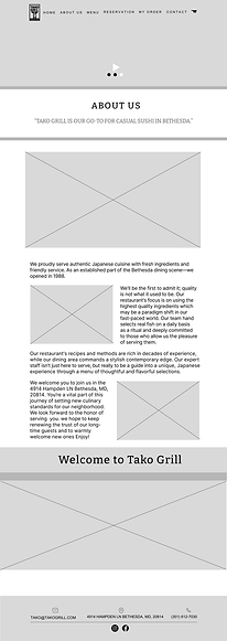
Early low-fidelity wireframes focused on defining layout structure, content hierarchy, and navigation flow, establishing a clear foundation before applying visual and interaction design.
I created low-fidelity wireframes to explore layout structure, define content hierarchy, and establish clear navigation flow.
LOW FIDELITY
MOBILE


Home page
Menu
My Order
Reservation
Contact Us
Responsive low-fidelity wireframes demonstrate how layout, navigation, and content hierarchy adapt across mobile devices, ensuring usability, clarity, and consistent user experience across screen sizes.
MID–FIDELITY
INTERACTION DESIGN
Interaction Definition
DESKTOP

Home page
About


Tracking
My order
My Order

Reservation

Contact Us
Menu
MID FIDELITY
MOBILE
Mid-fidelity wireframes introduced refined layout structure, clearer content hierarchy, and functional interaction patterns. This stage focused on improving usability, defining navigation flows, and preparing the foundation for final visual design implementation.
I refined layouts, interaction patterns, and usability through mid-fidelity wireframes.


About
Home page


Put Order
Navigation and
Menu


Tracking
My order


Contact Us
Reservation
My Order
Mid-fidelity mobile wireframes refined layout, content hierarchy, and interaction patterns. This stage improved usability, defined mobile navigation flow, and prepared the foundation for the final visual design.
FINAL HIGH–FIDELITY
DESKTOP
USER INTERFACE DESIGN
The final high-fidelity designs implement the defined layout, interaction patterns, and visual system to deliver a cohesive, scalable, and production-ready user interface.

Home page

About

My Order
Tracking
My Order

Reservation
Menu
High-fidelity desktop wireframes applied final visual design, typography, and branding to create a realistic interface. This stage validated usability and prepared the design for final implementation and developer handoff.
I designed high-fidelity UI screens using the final design system and visual branding.
HIGH FIDELITY
MOBILE
About


Home page


Navigation and
Menu

Put Order


Tracking
My Order

Reservation

Contact Us
My Order
High-fidelity mobile wireframes applied final visual design, branding, and typography to create a polished, responsive interface. This stage validated usability, ensured consistency, and prepared the design for implementation and developer handoff.
FINAL DESIGN OUTCOME
• Established a clear and scalable navigation hierarchy
• Delivered a fully responsive experience across desktop and mobile devices
-
Improved usability through iterative refinement from low- to high-fidelity design stages
• Produced a production-ready UI system aligned with brand and accessibility standards
INTERACTIVE PROTOTYPE
I created an interactive Figma prototype to simulate key user flows, including browsing the menu, placing an order, and making a reservation. This enabled usability validation, interaction refinement, and ensured a seamless, culturally immersive experience before development handoff.
The prototype validated core task flows and ensured users could complete ordering and reservation actions efficiently.
Figma Prototype Demonstration

DESIGN SYSTEM &
DOCUMENTATION
Throughout the Tako Grill project, I maintained comprehensive documentation to support the design process, including user research insights, persona development, site map planning, and design system components (atoms, molecules, organisms). This ensured consistency, enabled efficient collaboration, and supported scalable future development.
Documentation

ACCESSIBILITY &
INCLUSIVE DESIGN
Accessibility was a key consideration in the Tako Grill redesign. I ensured text had sufficient color contrast, used readable typefaces, and maintained a clear visual hierarchy.
Interactive elements like buttons and links were designed with proper sizing and spacing for easy tap targets. Alt text and semantic structure were also considered to support screen readers and create an inclusive experience for all users.
Accessability
